01 / Signals
See the whole signal
Bring product requests, research notes, and operational alerts into one measured view. Every signal arrives with context, priority, and a clear owner.
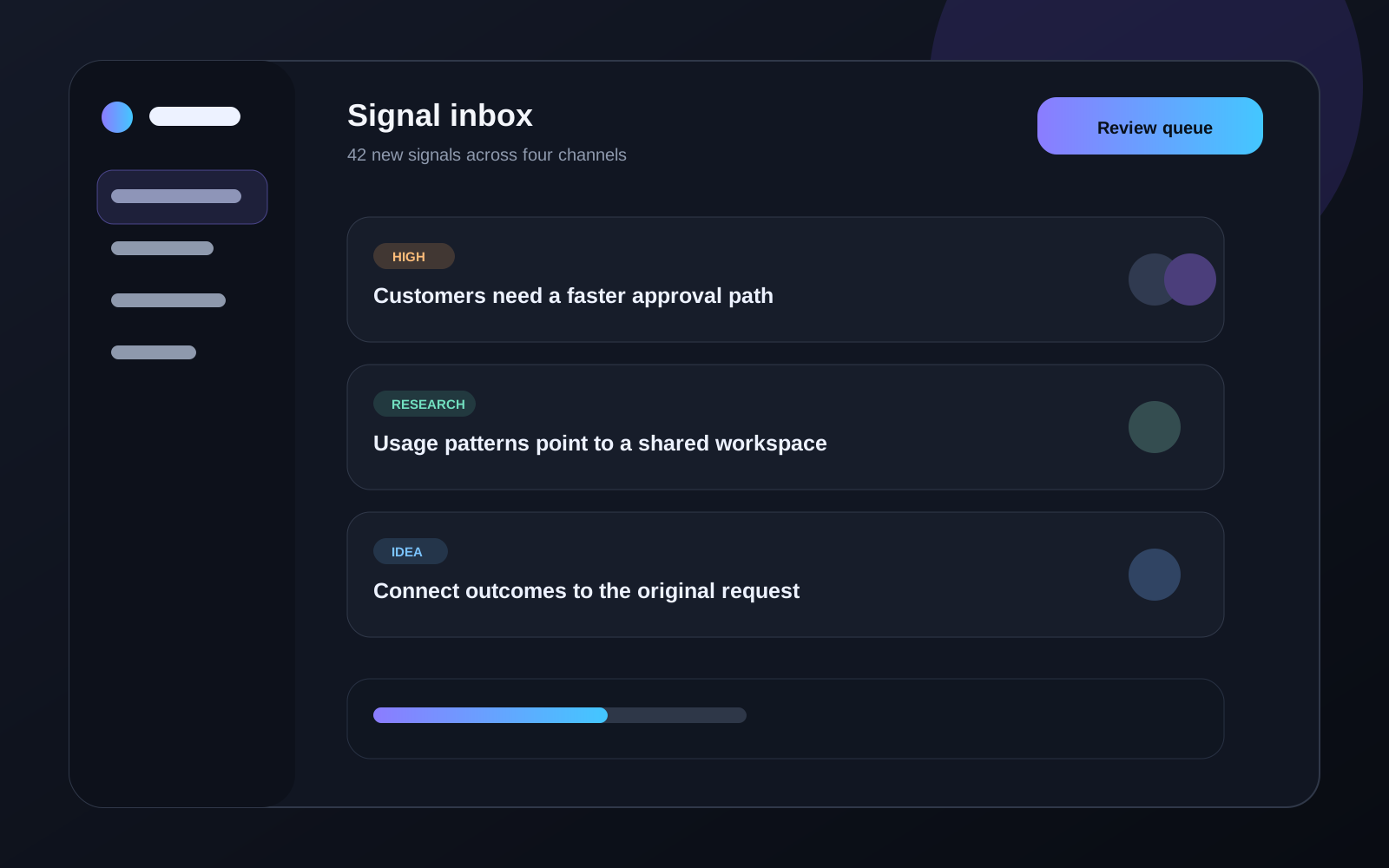
A free sticky feature section for React with alternating copy and a scroll-swapped product preview.
01 / Signals
Bring product requests, research notes, and operational alerts into one measured view. Every signal arrives with context, priority, and a clear owner.
02 / Decisions
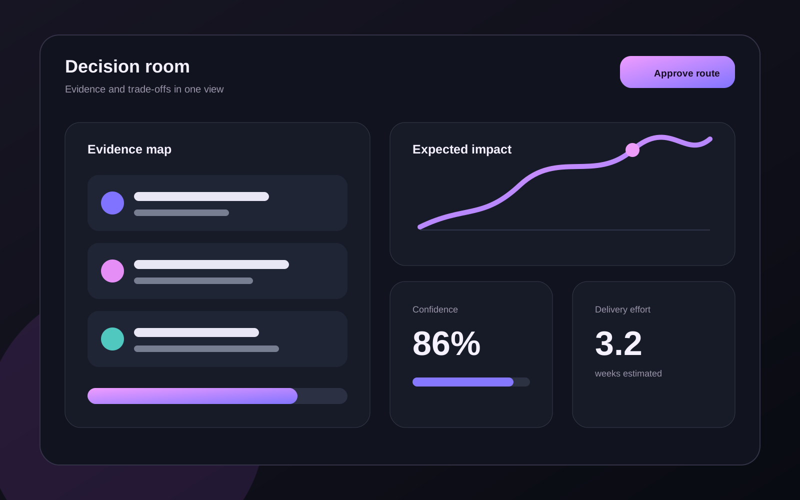
Compare the evidence behind each decision before work begins. Teams can see the trade-offs, dependencies, and expected outcome without chasing another status update.
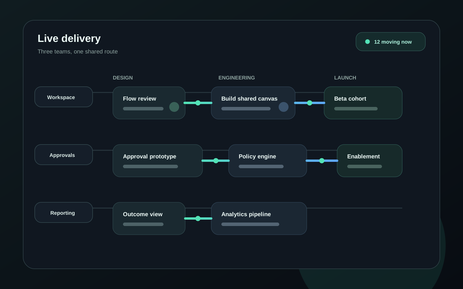
03 / Delivery
Follow live work across design, engineering, and launch. The shared operating view makes blocked work visible while there is still time to change the route.
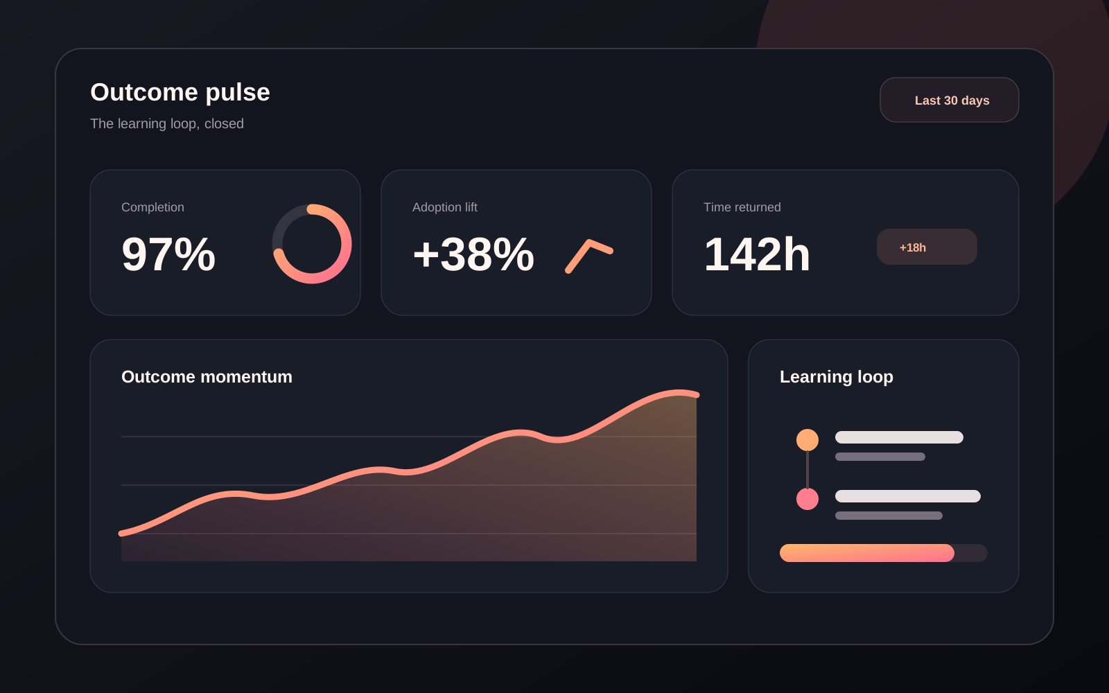
04 / Outcomes
Connect shipped work back to the original signal. Outcomes, decisions, and time saved stay together, giving the next planning cycle a stronger starting point.
<FeatZigzagSticky
  items={[
    {
      eyebrow: "01 / Signals",
      title: "See the whole signal",
      description:
        "Bring every product request into one measured view.",
      imageSrc: "/images/signals.png",
      imageAlt:
        "Product signal dashboard grouped by priority.",
    },
    {
      eyebrow: "02 / Decisions",
      title: "Shape a confident route",
      description:
        "Compare evidence, impact, and effort before work begins.",
      imageSrc: "/images/decisions.png",
      imageAlt:
        "Decision workspace comparing impact and effort.",
    },
    {
      eyebrow: "03 / Delivery",
      title: "Keep every handoff moving",
      description:
        "Follow live work across design, engineering, and launch.",
      imageSrc: "/images/delivery.png",
      imageAlt:
        "Delivery timeline moving across product teams.",
    },
  ]}
/>
Zigzag Sticky Features is a free sticky feature section for React and Next.js that pairs sequential product copy with a CSS-sticky preview, using Tailwind and Motion preview swaps. Each story remains readable in document order while the matching product image changes as the story crosses a configurable line in the viewport. The two-column layout follows the section's own width rather than the screen's, so a narrow column keeps the stacked story-and-image layout.
The component keeps native scrolling untouched and never pins with JavaScript. Mobile visitors, reduced-motion users, and pages without JavaScript receive the same complete copy-and-image sequence as a static stack.
Add the @te registry to your components.json once:
{
  "registries": {
    "@te": "https://templateempire.io/r/{name}.json"
  }
}
Then install the component:
npx shadcn@latest add @te/feat-zigzag-stickyimport { FeatZigzagSticky } from "@/components/feat-zigzag-sticky";
const features = [
{
eyebrow: "01 / Signals",
title: "See the whole signal",
description: "Bring every product request into one measured view.",
imageSrc: "/images/signals.png",
imageAlt: "Product signal dashboard grouped by priority.",
},
{
eyebrow: "02 / Decisions",
title: "Shape a confident route",
description: "Compare evidence, impact, and effort before work begins.",
imageSrc: "/images/decisions.png",
imageAlt: "Decision workspace comparing impact and effort.",
},
];
export default function Page() {
return <FeatZigzagSticky items={features} mediaSide="right" />;
}| Prop | Type | Default | Description |
|---|---|---|---|
| items | ReadonlyArray<{ eyebrow: string; title: string; description: string; imageSrc: string; imageAlt: string }> | required | Two to six complete feature stories. Invalid counts or blank required values render nothing. |
| mediaSide | "left" | "right" | "right" | Sticky product-preview placement on wide screens. |
| pinDistance | number | 72 | Extra section runway in viewport-height units, clamped to 20 through 160. |
| activationOffset | number | 0.5 | Viewport activation point, clamped to 0.25 through 0.75. |
| mediaScale | number | 0.96 | Inactive preview scale, clamped to 0.88 through 1. |
| swapDuration | number | 0.5 | Product-preview transition duration in seconds, clamped to 0.2 through 1.2. |
| radius | number | 28 | Product-preview corner radius in CSS pixels, clamped to 0 through 48. |
| className | string | undefined | Additional classes merged onto the section root. |
Retheme the active guide, narrative line, and product-preview surface with the three component tokens. Effect and geometry props can be combined with these tokens without editing the component source:
.te-feat-zigzag-sticky {
  --zigzag-sticky-accent: var(--ring);
  --zigzag-sticky-line: var(--border);
  --zigzag-sticky-panel: var(--card, var(--surface));
}